Early warning indicators of banking crises: expanding the family
Updated 20 March 2018: Table 4 has been corrected.
Household and international debt (cross-border or in foreign currency) are a potential source of vulnerabilities that could eventually lead to banking crises. We explore this issue formally by assessing the performance of these debt categories as early warning indicators (EWIs) for systemic banking crises. We find that they do contain useful information. In fact, over the more recent subsample, for household and cross-border debt indicators the information is similar to that of the more commonly used aggregate credit variables regularly monitored by the BIS. Confirming previous work, combining these indicators with property prices improves performance. An analysis of current global conditions based on this richer information set points to the build-up of vulnerabilities in several countries.1
JEL classification: E37, E44, F34, G21.
Early warning indicators (EWIs) of banking crises are typically based on the notion that crises take root in disruptive financial cycles. The basic intuition is that outsize financial booms can generate the conditions for future banking distress. The narrative of financial booms is well understood: risk appetite is high, asset prices soar and credit surges. Yet it is difficult to detect the build-up of financial booms in real time and with reasonable confidence. It is here that EWIs come in. Many studies, including at the BIS, have found that one can identify such unsustainable booms reasonably well based on, say, deviations of credit and asset prices from long-run trends ("gaps") breaching certain critical thresholds.
In order to detect the build-up of vulnerabilities around the globe, in recent years the BIS has regularly published credit-to-GDP gaps, economy-wide debt service ratios (DSRs) and, less frequently, property price gaps. While these aggregate indicators are useful, research has pointed to the importance of specific subcategories of debt as a source of vulnerabilities, especially household debt and cross-border and/or foreign currency debt (international debt for short).
Against this backdrop, in this special feature we do two things. First, we assess the EWI performance of both household and international debt. Here, we draw extensively on BIS statistics, notably the international banking and securities statistics as well as sectoral credit data and DSRs. Second, we map the statistical analysis into current conditions, taking into account also the information from aggregate indicators. In the process, we take the opportunity to clarify some common misconceptions about the interpretation of EWIs.
We come up with three main findings. First, indicators based on household and international, in particular cross-border, debt do contain useful information about future banking distress. The household sector DSRs perform especially well. Second, as might be expected, it is possible to further improve performance by combining individual indicators. Confirming previous work, we find that combining debt variables with property prices is especially helpful. Finally, the indicators currently point to the build-up of risks in several economies.
The feature is structured as follows. The first section reviews the rationale behind EWIs and provides a first look at the behaviour of selected candidate indicator variables around crises. The second formally evaluates their EWI performance. We first compare indicators on a standalone basis and then show the gains in predictive power from combining them. The third section draws on these findings to discuss current vulnerabilities. A box provides a short guide on how to interpret indicators. A final section concludes.
The rationale behind EWIs
EWIs typically capture booms in the financial cycle in a stylised way. The notion of the financial cycle refers to the self-perpetuating sequence of financial expansions and contractions that can amplify business fluctuations (Minsky (1982), Kindleberger (2000), Borio (2014)). And outsize financial booms can lead to stress and even financial crises. While progress has been made, measuring the financial cycle remains challenging: the underlying theoretical modelling is scant and there is no single aggregate measure of financial activity. That said, a consensus has started to emerge that credit aggregates and asset prices, especially property prices, play an important role (Terrones et al (2011), Drehmann et al (2012)).
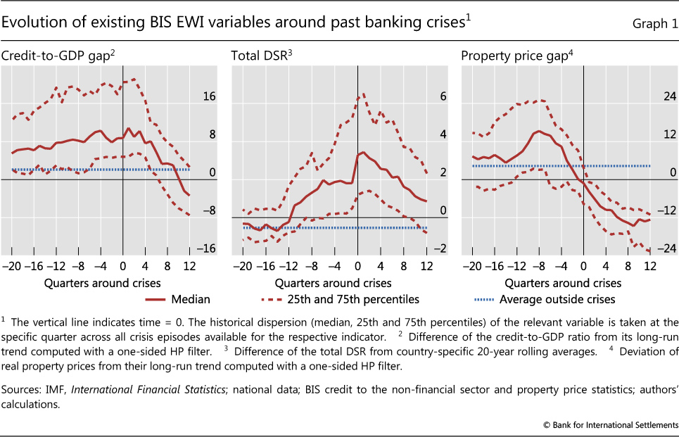
The existing BIS EWIs translate the intuitive notion of a financial boom into simple and transparent measures. The BIS has regularly published and monitored aggregate private sector credit-to-GDP gaps, residential property price gaps and DSRs for the private non- financial sector. The credit-to-GDP gap is calculated as the difference between the credit-to-GDP ratio and its (one-sided) long-term trend.2 Detrending is designed to remove the impact of benign, long-term changes in the underlying series, for example those that result from financial development. The gap opens up if the increase in the credit-to-GDP ratio strongly outpaces the trend for some time, pointing to a possible financial imbalance. The property price gap is the equivalent measure, defined as the deviation of inflation-adjusted property prices from their trend. DSRs measure interest payments and amortisations relative to income.3 As high credit growth feeds into higher debt service down the road, DSRs rise during credit booms (Drehmann et al (2017)). And since they take into account interest payments, they could perform better than the credit gap or credit growth when debt builds up continuously but more slowly over time, making balance sheets vulnerable to increases in interest rates.
It is thus unsurprising that credit, DSRs and property price gaps were comparatively high before past crises (Graph 1). For much the same reason, they perform well as EWIs on a standalone basis, and even better if combined (Borio and Lowe (2002a), Drehmann et al (2011), Drehmann and Juselius (2012), Detken et al (2014)).4
In addition to the aggregate credit developments covered by the current BIS EWIs, recent research has highlighted the importance of the household sector specifically. While higher household debt boosts consumption and output growth in the short run, too much of it can lower output growth in the medium to long term (eg Mian et al (2017), Lombardi et al (2017), Zabai (2017)). Excessive household debt has also been found to herald banking crises (eg Jordà et al (2016), IMF (2017), Drehmann et al (2017)). As such, indicators assessing household debt developments feature prominently in many central bank financial stability reports (eg Bank of Canada (2017), ECB (2017), Bank of England (2017)).
We consider two household sector indicators. The first is the household credit-to-GDP gap - an exact analogue of the total credit-to-GDP gap but using only credit to households in the numerator.5 The second is the difference between the household sector DSR and its 20-year rolling average (Drehmann et al (2017)).6 By normalising with a one-sided trend or a rolling average, we try to mimic the real-time environment policymakers face: the indicators are only based on past information, available at the time decisions are made.
Policymakers have also long focused on foreign currency and/or cross-border debt as a source of financial stability risks (Bruno and Shin (2015), Chui et al (2014), BIS (2017), Borio et al (2011), Avdjiev et al (2012)). In part because of data limitations, the EWI literature has operationalised this by looking at current account deficits (eg Lo Duca and Peltonen (2013)) or exchange rate developments (eg Borio and Lowe (2002b) and Gourinchas and Obstfeld (2012)).7
Drawing on the BIS international banking and debt statistics, we go one step further and explicitly evaluate cross-border borrowing as well as foreign currency debt, issued across borders and at home. In order to normalise by country size and to tease out medium-term developments, we take the three-year growth rates in the corresponding ratios to GDP.8 The foreign currency debt is that of non-banks. For cross- border claims we take a broader perspective that captures lending to non-banks and banks.9 We do so as indirect cross-border credit, ie cross-border credit that banks lend on to non-banks, is a frequent enabler of domestic credit expansions (Avdjiev et al (2012)).10
Data coverage differs across indicators.11 We have credit-to-GDP gaps and cross-border credit for 42 jurisdictions, often from the first quarter of 1980 to the second quarter of 2017.12 Data are most limited for the household DSR, which is only available for 27 jurisdictions and often starts only in the mid-1990s. For crisis dating, we rely on the new European Systemic Risk Board crisis data set (Lo Duca et al (2017)) for European countries and on Drehmann et al (2010) for the rest.13
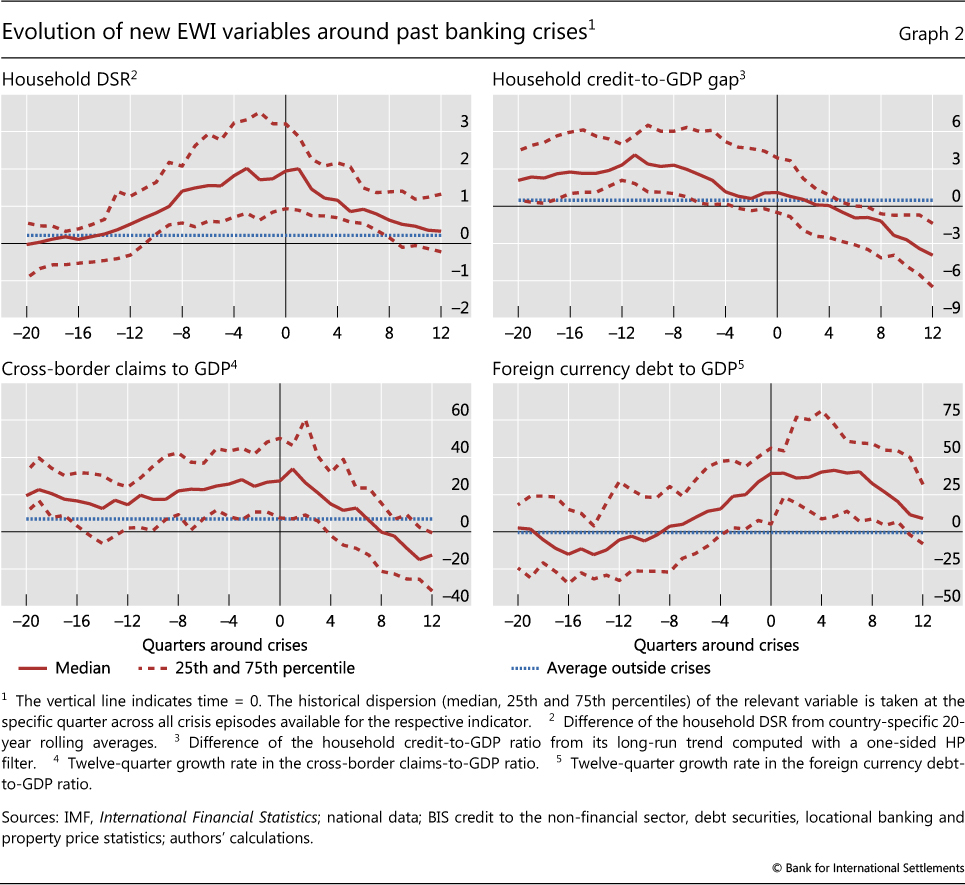
A first glance at the data indicates that household debt may provide useful signals of the build-up of vulnerabilities (Graph 2). The household sector DSR (top row, left-hand panel) has been unusually high in the run-up to crises. The household credit-to-GDP gap (top row, right-hand panel) has also tended to be above normal levels during those phases.
The same holds for the international debt indicators (Graph 2, bottom row). The growth rate of the foreign currency debt-to-GDP ratio increases strongly pre-crisis, though it exhibits relatively high variation across countries (dashed lines). That of the cross- border debt-to-GDP ratio is also markedly higher but less variable.
Evaluating EWIs
When formally evaluating the performance of the EWIs, one would ideally like to know how policymakers assess the trade-off between missed crisis calls (type I errors) and false alarms (type II errors). However, this cannot be done with any precision, not least due to the limited experience from which to estimate expected costs and benefits (CGFS (2012)).
Absent well specified trade-offs, one way to assess the performance of EWIs is to consider the full mapping between type I and type II errors. This mapping is called the receiver operating characteristic (ROC) curve (see Box A for details). The area under the curve (AUC) is a convenient and interpretable summary measure of the signalling quality of a binary (yes/no) signal. A completely uninformative indicator has an AUC of 0.5. Correspondingly, the AUC for the perfect indicator equals 1. The AUC of an informative indicator falls in between and is statistically different from 0.5.
The AUC is a useful starting point, but it does not provide any information about the critical thresholds that, if breached, should raise concerns about financial stability risks. These ultimately depend on policymakers' preferences. To derive the thresholds, we assume that policymakers choose one that minimises the noise-to-signal ratio (the ratio of false alarms to correctly predicted events) while capturing at least two thirds of the crises, as in Borio and Drehmann (2009). (Box A discusses the link between this criterion and the ROC curve).
To be useful for policy, EWIs should not only have statistical forecasting power and rely on real-time information, but also satisfy three additional requirements (Drehmann and Juselius (2014)): timing, stability and ease of interpretation.
Having the right timing means that the indicators' signals should arrive early enough so that policy measures can be implemented and have an impact. That said, signals that arrive too early can be problematic (eg Caruana (2010)). We focus on a 12-quarter forecast horizon.14 Employing a multi-year horizon also recognises that the indicators may help identify the build-up of vulnerabilities, but cannot be expected to pinpoint the specific timing of a crisis.
EWIs should also provide stable signals. Policymakers prefer to react to persistent movements, given the uncertainties involved. Stability requires that the forecast performance should not decrease as crises approach. This is a problem for residential property prices (Drehmann and Juselius (2012)), for which growth tends to slow or even become negative closer to crises (Graph 1, left-hand panel). This makes it hard to discern in real time whether the slowdown reflects the typical pre-crisis behaviour of property prices or a welcome correction.
Finally, unless EWIs are easy to interpret intuitively, their signals are likely to be ignored (eg Önkal et al (2002), Lawrence et al (2006)). This is why our EWIs are simple, transparent and based on the financial cycle logic. Their simple structure may also reduce the risk of overfitting associated with more sophisticated techniques.
Box A
Evaluating EWIs: ROC curves, noise-to-signal ratios and critical thresholds
Selecting an early warning indicator (EWI) involves making a choice about the trade-off between the rate of correct predictions and the rate of false alarms. There are four possible value combinations of a binary signal ("on" or "off") and subsequent event realisations ("occurrence" or "non-occurrence"). The perfect indicator signals "on" ahead and only ahead of all occurrences; an uninformative one has an equal probability of being right or wrong, like a coin toss.
It is possible to illustrate the trade-off between correct event predictions (as a share of all events) and false alarms (as a share of all normal periods) when choosing a threshold in the case of the credit-to-GDP gap for the United Kingdom. The left-hand panel of Graph A shows the evolution of the gap since 1980. The shaded areas highlight the three years before the crises in 1991 and 2007, the period when we would like to see a signal based on the assumed three-year prediction horizon. The dashed red horizontal line indicates a credit-to-GDP gap of 9 - the optimal threshold given our analysis (Table 2). In both pre-crisis periods, the gap exceeded 9, so the prediction rate is 100% (red circles). Yet there are also false alarms (black circles). Increasing the threshold above 9 reduces the number of false calls. But once the threshold exceeds 11.5, the crisis in 2007 is no longer predicted, so that the prediction rate falls to 50%. Conversely, lowering the threshold from 9 does not increase the prediction rate and leads only to more false alarms.
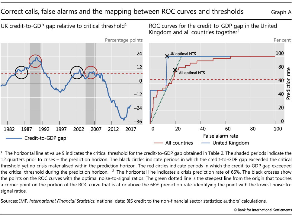
The receiver operating characteristic (ROC) curve captures this trade-off between correct predictions and false alarms for all thresholds. For the United Kingdom, the prediction rate can only be 100%, 50% and 0% (Graph A, right-hand panel, blue line), with false alarm rates decreasing as the threshold increases. The solid red line depicts the ROC curve for the credit-to-GDP gap based on all the available data in our sample. We can see that the credit-to-GDP gap is an informative indicator but is not perfect. For a perfect indicator we would find at least one threshold with a prediction rate of 100% and a false alarm rate of 0%. At the other end of the spectrum, a completely uninformative indicator would have an ROC curve that equalled the 45° line for every threshold, ie the same rate of correct and false calls.
The area under the ROC curve (AUC) provides a summary measure of the signalling quality of an indicator. Intuitively, it captures the average gain over the uninformed case (the 45° line) across all possible threshold combinations. The uninformative indicator has an AUC equal to 0.5 (ie the area under the 45° line equals 0.5), while that for the fully informative indicator is equal to 1. The intermediate cases have values in between.
While the ROC maps the full set of trade-offs, the policymaker may weigh missed crisis calls and false alarms differently. Unfortunately, these preferences are not known. As discussed in the main text, we therefore assume that policymakers choose a threshold that minimises the noise-to-signal ratio (the ratio of false alarms to correctly predicted events), while capturing at least two thirds of the crises.
It is possible to find the points on the ROC curve that correspond to the optimal thresholds for the United Kingdom and the more general case (black crosses). The UK case is especially intuitive. One picks the part of the ROC curve that identifies a prediction rate of at least 66% of crises - here the only possible one is 100%. Next one moves on that line as far as left as possible, thereby minimising false alarms, ie one chooses the leftmost corner. The more general case is slightly more complicated, although the procedure is the same. One picks the steepest line from the origin (dotted green line) that touches a corner point on the portion of the ROC curve that is at or above the 66% prediction rate (red dashed line). This works because the slope of such a line equals the signal-to-noise ratio of the threshold associated with the corner point on the ROC curve. And as the signal-to-noise ratio is the inverse of the noise-to-signal ratio, the steepest line finds the point on the ROC curve with the lowest noise-to-signal ratio.
Standalone indicators
To evaluate and compare the performance of the indicators on a standalone basis, we proceed in two steps. Initially, to assess their general information content, we use the AUC criterion. We then evaluate the indicators from an operational perspective by analysing optimal thresholds based on specific preferences.
We do so using two different samples: the full sample available for each indicator, and the much smaller common sample. The common sample allows a comparison of like with like, but it reduces our sample size considerably. We therefore also use the full sample available for each indicator as a comparison.
Although we try to collect as much data as possible, predicting crises inevitably means predicting rare events. Data coverage is best for the credit-to-GDP gap. But even then, we only cover 30 crises. The common sample covers 19 episodes, 12 of which are related to the Great Financial Crisis (GFC). In addition, the data set is tilted towards advanced economies. Thus, the use of the full sample available for each indicator is important for robustness. For brevity, we only report this for the threshold analysis. In addition, we did robustness checks, not reported here, running the statistical tests on pre-and post-2000 subsamples to ensure that the GFC does not drive the results. While all these robustness checks underpin the insights of this paper, we cannot escape the underlying (fortunate) problem that crises are rare. Results therefore have to be interpreted with some caution.
These formal statistical tests confirm the insights from the raw data and previous work.
The total DSR and the credit-to-GDP gap, two indicators traditionally used as BIS EWIs, have the highest AUCs across all forecast horizons (Table 1, top two rows). While there is no statistically significant difference between their information content, the aggregate DSR has the highest AUC for the short horizon and the credit-to-GDP gap the highest AUC for the longer one. This confirms earlier findings (Drehmann and Juselius (2012)). In line with the results from Graph 1, the property price gap performs particularly well around two years before crises, but it becomes uninformative in the pre-crisis year, when it tends to decline or close.
Household debt indicators, in particular the household DSR, are also informative (Table 1, fourth and fifth rows). Based on the AUC point estimates, the household DSR performs even slightly better than the aggregate credit gap in the pre-crisis year. It also outperforms the household credit-to-GDP gap, which we will therefore not consider in the rest of this article.15
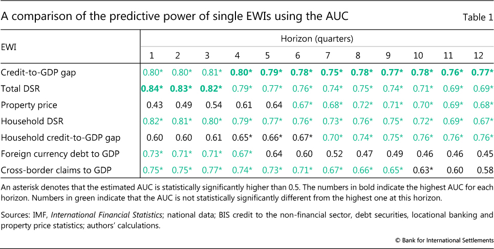
Confirming what policymakers have long stressed, international debt also contains useful information (Table 1, last two rows), although on balance not as much as the aggregate and household debt indicators. AUCs for the cross-border claims indicator are statistically significant but lower than those of the top- performing indicator, even though statistically it is hard to distinguish between the two. The foreign currency debt indicator does not perform as well as the traditional indicators throughout. To simplify the analysis, in what follows we retain only the indicator based on cross-border claims.
We next operationalise the indicators for policymaking, based on the chosen threshold criteria (Table 2). We show the values of the noise-to-signal ratio for different indicators subject to predicting correctly two thirds of the crises. The left- and right-hand panels show the EWIs' performance over the longest available sample and over a smaller common sample, respectively.16
The analysis confirms that the household DSR adds value. It has the lowest noise-to-signal ratio across all indicators and samples. A 1.4 percentage point positive deviation of the household DSR from its long-run average captures around 70% of crises with a noise-to-signal ratio of roughly 20% across the two samples, ie one false crisis call for every five correct ones. This result is not only driven by the GFC: the household sector DSR also exceeded this threshold in four out of the six crises before 2000.
In terms of noise-to-signal ratio, the performance of the cross-border claims indicator is roughly equivalent to that of the credit-to-GDP gap, regardless of the sample considered. However, the credit-to-GDP gap predicts a larger percentage of crises.
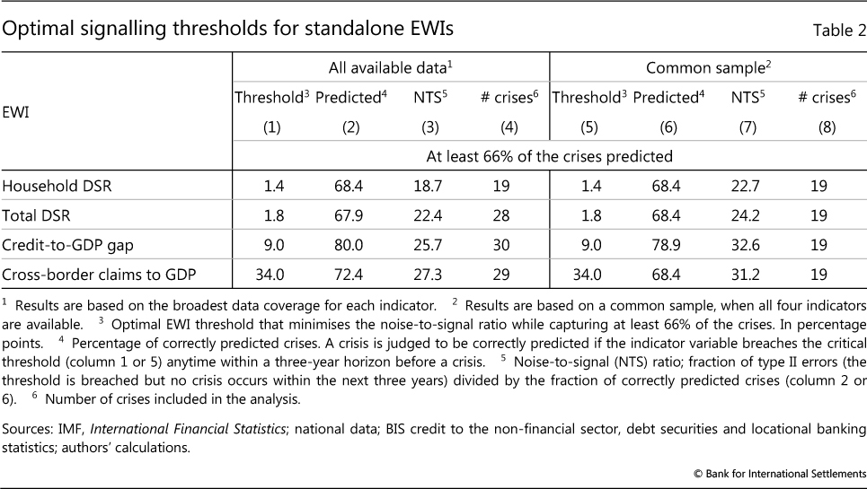
The comparison of noise-to-signal ratios should not, however, be overemphasised. For instance, the somewhat higher noise-to-signal ratio of the credit- to-GDP gap is mainly due to its tending to signal crises very early, some five to seven years ahead of the event (Drehmann et al (2011)). While these are "wrong" signals according to our formal criteria, they nevertheless still correctly identify the build-up of vulnerabilities.17
Table 2 also highlights the EWIs' robustness. Despite large differences in sample size between the longest and the smaller common sample (left-hand panel versus right-hand panel), the thresholds for each indicator are identical in both cases. This shows that the results are not solely due to advanced economies or crises related to the GFC - two key features of the common sample. The main insights from the table are also robust to performing bivariate comparisons for each possible pair of indicators.
Combined indicators
Previous work has shown that combining information from credit and asset markets into composite indicators can improve performance. This is intuitive as financial booms feature both exuberant credit growth and buoyant asset prices. Given the role of housing as collateral, the literature has highlighted in particular how residential property prices amplify the financial cycle, despite their inferior performance as standalone indicators (Table 1).
Thus, we next derive optimal thresholds for combinations of debt variables and property prices. We follow the same logic as before. But for a warning signal to be issued we now require that (i) the debt indicator has breached the threshold and (ii) the property price gap was above 11 within the 12 quarters preceding the breach. We choose 11 because it is the standalone critical threshold obtained for this variable based on predicting at least two thirds of the crises.18
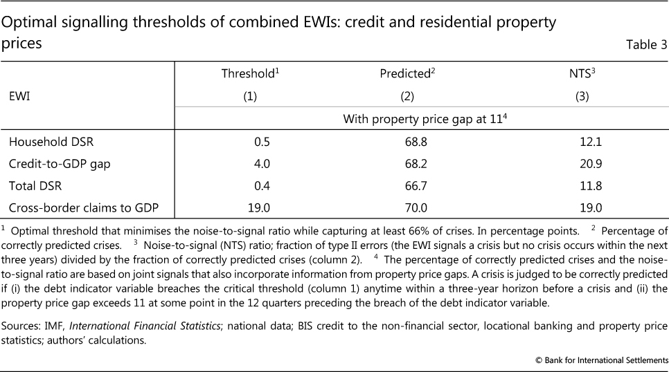
The condition for property prices is deliberately backward-looking. As discussed above, property price growth tends to slow from very high rates ahead of crises, so that the gap closes (Graph 1, right-hand panel).19 If we were to require that both credit and property price gaps exceed critical thresholds simultaneously, the combined signal would start to "switch off" in the late stages of the boom.
Combining information from credit and property markets improves the EWIs' precision considerably (Table 3). Noise-to-signal ratios fall below 21%, to as low as 11.8%.
The combined EWIs also lead to lower critical thresholds for the debt indicators. This is intuitive, since the information contained in property prices underscores the signal issued by rapid credit expansion, so that the threshold can be lower.
Assessing current vulnerabilities
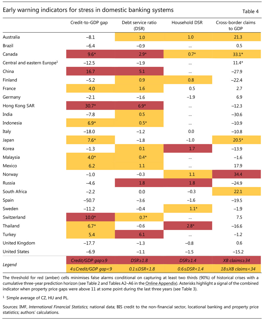
What do the EWIs suggest about current vulnerabilities? Table 4 takes a closer look at the status of the various indicators as of June 2017, while Box B provides a short discussion of how to use and interpret EWIs more generally.
The colour coding is based on the standalone indicators (Table 2). Cells are marked in red if the indicator has breached the threshold for predicting at least two thirds of the crises. Those marked in amber correspond to the lower threshold required to predict at least 90% of the crises.20 This avoids a false sense of precision and captures the very gradual build-up in vulnerabilities. Asterisks indicate that the corresponding combined credit-cum-property price indicator (from Table 3) has breached its critical threshold.
The picture that emerges is a varied one.
Aggregate credit indicators point to vulnerabilities in several jurisdictions (Table 4, first two columns). Canada, China and Hong Kong SAR stand out, with both the credit-to-GDP gap and the DSR flashing red. For Canada and Hong Kong, these signals are reinforced by property price developments. The credit-to-GDP gap also flashes red in Switzerland, whereas the total DSR flashes red in Russia and Turkey. Credit conditions are also quite buoyant elsewhere. Credit-to-GDP gaps and/or the total DSR send amber signals in some advanced economies, such as France, Japan and Switzerland, as well as in several emerging market economies (EMEs). In Indonesia, Malaysia and Thailand, as well as some other countries, property price gaps underscore this signal.
Some jurisdictions also exhibit some signs of high household sector vulnerabilities. In Korea, Russia and Thailand, the household sector DSR flashes red (Table 4, third column). In Thailand, the red signal for the household DSR is underlined by the property price indicator. Property prices have also been in elevated in Sweden and Canada, which exhibit an amber signal for the household DSR.
The cross-border claims indicator supports the risk assessment for several countries and flags some potential external vulnerabilities for others (Table 4, fourth column). The indicator flashes red for Norway, and is amber for a number of economies.
While providing a general sense of where policymakers may wish to be especially vigilant, these indicators need to be interpreted with considerable caution (see also Box B). As always, they have been calibrated based on past experience, and cannot take account of broader institutional and economic changes that have taken place since previous crises. For example, the much more active use of macroprudential measures should have strengthened the resilience of the financial system to a financial bust, even if it may not have prevented the build-up of the usual signs of vulnerabilities. Similarly, the large increase in foreign currency reserves in several EMEs should help buffer strains. The indicators should be seen not as a definitive warning but only as a first step in a broader analysis - a tool to help guide a more drilled down and granular assessment of financial vulnerabilities. And they may also point to broader macroeconomic vulnerabilities, providing a sense of the potential slowdown in output from financial cycle developments should the outlook deteriorate.
Box B
What do EWIs tell us?
This box explains how to read the table that assesses current vulnerabilities based on the set of early warning indicators (EWIs). Then it explains the limitations of those indicators in the context of a broader analysis of vulnerabilities,
To interpret the table entries, it helps to understand the methodology used to derive the critical thresholds that - if crossed - lead to a warning signal. For any indicator, we start off with a large sample spanning countries and time that ideally contains as many crises and non-crisis periods as possible. After checking whether the indicator has more EWI power than a coin toss, we search over a range of potential thresholds that, when breached, issue a warning signal. We judge a crisis as correctly predicted if there is a warning signal at least once in the 12 quarters preceding the crisis, ie if the crisis occurs anytime within the three years following the breach. If a signal is issued but no crisis occurs within that time frame, we count this as a false alarm.
We choose two different thresholds to identify amber and red "alert zones". In both cases the calibration, drawing on historical experience, minimises the ratio of false alarms to correct warning signals (the "noise-to-signal ratio"). But one threshold is chosen so as to predict at least two thirds of the crises (red), and the other at least 90% (amber). The red threshold is more stringent (higher) in the sense that it is exceeded less often.
The cells also include asterisks (*). These refer to instances in which the combined behaviour of the corresponding debt and property price indicators signal vulnerabilities. For this debt-cum-property price combined indicator we follow a similar logic to the one above. We keep the property price gap threshold constant at its optimal standalone value and then optimise over the debt indicator threshold, so as to capture at least 66% of crises while minimising the noise-to-signal ratio. In other words, for a warning signal to be issued, we require that (i) the debt indicator breached the critical threshold and (ii) the property price gap was above 11 (the red threshold for the property price gap on its own) within the three years before the breach. When this happens, we add an asterisk to the relevant EWI.
To interpret these signals correctly from a statistical viewpoint, a few points are worth recalling:
- Over the calibration period, there were naturally many instances in which the indicators breached the thresholds (corresponding to signals denoted by the amber, red and * identifiers) but crises did not materialise within the following three years. The more often this happens, the higher the noise-to-signal ratio.
- This may happen because crises do not materialise at all: the indicator subsequently switches off and imbalances correct themselves. Alternatively, it may happen because the signals may occur "too early" (eg five or six years before a crisis), with the indicator correctly continuing to signal risks until the crisis breaks out.
 In general, even when the indicators identify the risk of crises correctly, it is unrealistic to expect them to identify the timing with any precision.
 - Noisy signals also mean that the statement "66% of crises were preceded by a breach of the EWI threshold" is not equivalent to "the crisis probability is 66% once the threshold is breached". Or putting it differently, the former statement says that "given that a crisis has occurred, the threshold was breached in 66% of the cases"; the latter means "given that the threshold is breached, a crisis occurs in 66% of the cases". The reason the two statements are not equivalent is that some breaches do not herald crises, ie the noise-to-signal ratio is higher than zero. In fact, in our sample and as a rule of thumb, the likelihood of a crisis emerging once the threshold for an indicator is breached is around 50%.

More generally, certain caveats need to be borne in mind:
- EWIs have only two settings: "on" or "off". They do not reflect the gradual intensification of a financial boom. (The use of two thresholds is designed to capture this to some extent.)
- The exact thresholds should not be overemphasised. We have run a battery of checks and drawn on other research to make sure our economic insights are as robust as possible. But the exact optimal thresholds identified can vary by a few percentage points across specifications. Given these uncertainties, whether an indicator is just above or below a threshold is not a first-order issue for monitoring purposes.
- EWIs are based on historical relationships. Thus, structural breaks may reduce their predictive power, eg as a result of increased use of macroprudential measures or changes in prudential regulation more broadly. This is only partly mitigated by evidence indicating that similar variables have displayed consistent predictive power going back to at least the 1870s (eg Schularick and Taylor (2012)).
- EWI thresholds are common across countries. Thus, they cannot take into account country-specific features. This is inevitable: as crises are rare events, it is not possible to calibrate the indicators with any statistical confidence based on the experience of any individual country.
- The EWIs displayed in the table are specifically designed to capture only vulnerabilities linked to the financial cycle. Other vulnerabilities that could lead to banking crises are not considered (eg sovereign crises owing to unsustainable fiscal positions).
Taken together, these caveats suggest that EWIs cannot be analysed in isolation. They are best seen as a useful starting point for a more granular assessment of vulnerabilities.
Formally, we test whether the AUC is statistically significantly different from 0.5. We use backward-looking information for residential property prices, as the associated gaps tend to close ahead of crises (Graph 1). For instance, this is the case for the credit-to-GDP gap (Drehmann et al (2011)). The derivation of how likely a crisis is given an EWI signal is much more sample-dependent than the thresholds shown in Table 2 because of small sample issues.
Conclusion
This special feature has formally assessed the performance of household and international debt as EWIs for banking distress. These variables are found to contain useful information about banking system vulnerabilities, similar to that of their more widely used counterparts based on aggregate debt. Within the group of household-based indicators, the household debt service ratio stands out. Within that of international debt indicators, cross-border claims perform better than foreign currency debt.
At the same time, in assessing these results it is also important to take into account data limitations. Crises are rare events even in samples where data coverage is good. And they become "rarer" for samples over which we can consider household or foreign currency debt. This prevents a more detailed, robust analysis of EMEs in particular. More definite comparisons and inferences would require overcoming these limitations. Thus, improving the data is an area that deserves greater attention.
References
Avdjiev, S, R McCauley and P McGuire (2012): "Rapid credit growth and international credit: challenges for Asia", in V Pontines and R Siregar (eds), Exchange rate appreciation, capital flows and excess liquidity: adjustment and effectiveness of policy responses, The SEACEN Centre, Chapter VI. Also published as BIS Working Papers, no 377, April.
Bank for International Settlements (2017): 87th Annual Report, June.
Bank of Canada (2017): Financial system review, November.
Bank of England (2017): Financial Stability Report, issue no 42, November.
Basel Committee on Banking Supervision (2010): An assessment of the long-term economic impact of stronger capital and liquidity requirements, August.
Borio, C (2014): "The financial cycle and macroeconomics: what have we learnt?", Journal of Banking & Finance, no 45, pp 182-98. Also available as BIS Working Papers, no 395, December 2012.
Borio, C and M Drehmann (2009): "Assessing the risk of banking crises - revisited", BIS Quarterly Review, March, pp 29-46.
Borio, C and P Lowe (2002a): "Asset prices, financial and monetary stability: exploring the nexus", BIS Working Papers, no 114, July.
--- (2002b): "Assessing the risk of banking crises", BIS Quarterly Review, December, pp 43- 54.
Borio, C, R McCauley and P McGuire (2011): "Global credit and domestic credit booms", BIS Quarterly Review, September, pp 43- 57.
Bruno, V and H S Shin (2015): "Cross-border banking and global liquidity", The Review of Economic Studies, vol 82, no 2, April.
Caruana, J (2010): "The challenge of taking macroprudential decisions: who will press which button(s)?", speech at the 13th Annual International Banking Conference, Federal Reserve Bank of Chicago in cooperation with the International Monetary Fund, Chicago.
Chui, M, I Fender and V Sushko (2014): "Risks related to EME corporate balance sheets: the role of leverage and currency mismatch", BIS Quarterly Review, September, pp 34-47.
Committee on the Global Financial System (2012): Operationalising the selection and application of macroprudential instruments, CGFS Papers, no 48, December.
Detken, C, O Weeken, L Alessi, D Bonfim, M Boucinha, C Castro, S Frontczak, G Giordana, J Giese, N Jahn, J Kakes, B Klaus, J Lang, N Puzanova and P Welz (2014): "Operationalising the countercyclical capital buffer: indicator selection, threshold identification and calibration options", ESRB Occasional Papers, no 5.
Drehmann, M, C Borio and K Tsatsaronis (2011): "Anchoring countercyclical capital buffers: The role of credit aggregates", International Journal of Central Banking, vol 7, no 4, pp 189- 240.
--- (2012): "Characterising the financial cycle: don't lose sight of the medium term!", BIS Working Papers, no 380, June.
Drehmann, M, C Borio, L Gambacorta, G Jimenez and C Trucharte (2010): "Countercyclical capital buffers: exploring options", BIS Working Papers, no 317, July.
Drehmann, M, A Illes, M Juselius and M Santos (2015): "How much income is used for debt payments? A new database for debt service ratios", BIS Quarterly Review, September, pp 89-103.
Drehmann, M and M Juselius (2012): "Do debt service costs affect macroeconomic and financial stability? ", BIS Quarterly Review, September, pp 21-35.
--- (2014): "Evaluating early warning indicators of banking crises: satisfying policy requirements", International Journal of Forecasting, vol 30, no 3, pp 759-80. Also published as BIS Working Papers, no 421, August 2013.
Drehmann, M, M Juselius and A Korinek (2017): "Accounting for debt service: the painful legacy of credit booms", BIS Working Papers, no 645, June.
Drehmann, M and K Tsatsaronis (2014): "The credit- to-GDP gap and countercyclical capital buffers: questions and answers", BIS Quarterly Review, March, pp 55-73.
European Central Bank (2017): Financial stability review, May.
Gourinchas, P-O and M Obstfeld (2012): "Stories of the twentieth century for the twenty-first", American Economic Journal, Macroeconomics, vol 4, no 1, pp 226-65.
International Monetary Fund (2017): Global Financial Stability Report, October, Chapter 2.
Jordà, O, M Schularick and A Taylor (2016): "The great mortgaging: housing finance, crises and business cycles", Economic Policy, vol 31, no 85, pp 107-52.
Kindleberger, C (2000): Manias, panics and crashes, fourth edition, Cambridge University Press.
Laeven, L and F Valencia (2012): "Systemic banking crises database: an update", IMF Working Papers, no 12/163, June.
Lawrence, M, P Goodwin, M O'Connor and D Önkal (2006): "Judgmental forecasting: a review of progress over the last 25 years", International Journal of Forecasting, no 22, pp 493-518.
Lo Duca, M and T Peltonen (2013): "Assessing systemic risks and predicting systemic events", Journal of Banking & Finance, vol 37, pp 2183- 95.
Lo Duca, M, A Koban, M Basten, E Bengtsson, B Klaus, P Kusmierczyk, J Lang, C Detken and T Peltonen (2017): "A new database for financial crises in European countries", European Central Bank Occasional Papers, no 194, July.
Lombardi, M, M Mohanty and I Shim (2017): "The real effects of household debt in the short and long run", BIS Working Papers, no 607, January.
Mian, A, A Sufi and E Verner (2017): "Household debt and business cycles worldwide", Quarterly Journal of Economics, vol 132, issue 4, pp 1755-817.
Minsky, H (1982): Can "it" happen again?: essays on instability and finance, M E Sharpe.
Önkal, D, M Thomson and A Pollock (2002): "Judgmental forecasting", M Clements and D Hendry (eds), A companion to economic forecasting, Blackwell.
Schularick, M and A Taylor (2012): "Credit booms gone bust: monetary policy, leverage cycles, and financial crises, 1870-2008", American Economic Review, vol 102, no 2, pp 1029-61.
Terrones, M, A Kose and S Claessens (2011): "Financial cycles: What? How? When?", IMF Working Papers, no 11/76, April.
Zabai, A (2017): "Household debt: recent developments and challenges", BIS Quarterly Review, December, pp 39-54.
1 The authors would like to thank Stefan Avdjiev, Stijn Claessens, Ben Cohen, Ingo Fender, Mikael Juselius and Pat McGuire for helpful comments and Bat-el Berger, Anamaria Illes, Matthias Lörch, Kristina Micic and Taejin Park for excellent research assistance. The views expressed in this article are those of the authors and do not necessarily reflect those of the BIS.
2 The credit-to-GDP gap is the difference between the ratio of total non-financial sector credit to GDP and its trend based on a one-sided Hodrick-Prescott (HP) filter with the smoothing parameter equal to 400,000. Such a high value ensures a very slowly moving trend. The residential property price gap is the deviation of inflation-adjusted residential property prices from a similarly constructed trend. For a discussion of the appropriateness of this trend measure in this specific context, see Drehmann and Tsatsaronis (2014)).
3 Since most countries do not compile data on amortisation payments, these are estimated using information from debt maturities, interest rates and outstanding debt stocks (Drehmann et al (2015)).
4 The credit gap was first proposed by Borio and Lowe (2002a), and the literature has found broadly similar EWI performance for slightly different measures, such as five-year growth rates in the credit-to-GDP ratio (eg Schularick and Taylor (2012)). The credit-to-GDP gap has been incorporated into the policy process as the trigger variable for the imposition of a countercyclical capital buffer on supervised banks (BCBS (2010)).
5 We also assessed the three- or five-year growth rate of the household credit-to-GDP ratio. This did not have a statistically significantly different performance from the household credit-to-GDP gap.
6 As there are country-specific differences in the level, it is important to remove the long-run trend (Drehmann et al (2015)).
7 We also considered exchange rates and current account balances as indicators. But as they underperformed cross-border credit indicators, we exclude them from the reported results.
8 Foreign currency debt is composed of the sum of US dollar-, euro-, yen-, sterling- and Swiss franc-denominated debt in the form of cross- border loans to non-banks, international debt securities issued by non-banks and, where reported, local loans in foreign currency to non-banks. The series start in 1995, and we extend them backwards by applying the change in cross-border claims on non-banks from the BIS locational banking statistics. Our indicator on cross-border claims comprises lending in all instruments and currencies, to both banks and non-banks, as reported in the locational banking statistics. For both series we take the stocks and adjust them for breaks due to methodological or coverage changes. Given large breaks prior to 1984, we start from that point. See also the Online Appendix.
9 In addition to the growth rate in the gross claims relative to GDP, we also assessed the performance of a corresponding net indicator (claims minus liabilities). This is likely to be a better measure of the credit that remains within the country. That said, this variable did not perform as well as its gross counterpart.
10 Indirect credit is not included in the foreign currency debt series as we would run into problems of double-counting. For instance, a bank may borrow in foreign currency from abroad to lend domestically (also in foreign currency).
11 Coverage and sources are discussed in detail in the Online Appendix.
12 Our broadest sample includes Argentina, Austria, Australia, Belgium, Brazil, Canada, Chile, China, Colombia, the Czech Republic, Denmark, Finland, France, Germany, Greece, Hong Kong SAR, Hungary, India, Indonesia, Ireland, Israel, Italy, Japan, Korea, Malaysia, Mexico, the Netherlands, Norway, New Zealand, Poland, Portugal, Russia, Saudi Arabia, Singapore, Spain, South Africa, Sweden, Switzerland, Thailand, Turkey, the United Kingdom and the United States.
13 We exclude crises related to transitioning economies or that were imported from abroad based on Lo Duca et al (2017). In addition, we classify the crisis in 2008 in Switzerland as imported. For the statistical analysis we drop post-crisis periods as identified in Lo Duca et al (2017) and Laeven and Valencia (2012) for non-European countries.
14 Strictly speaking, one could drop the year that precedes the crisis, on the grounds that by then it would be too late to take major preventive steps.
15 Strictly speaking, the household credit-to-GDP gap performs marginally better than the household DSR for quarters 10 to 12. These differences are not statistically significant. Still, we drop the household credit-to- GDP gap because it becomes uninformative in the pre-crisis year.
16 Tables A2-A6 in the Online Appendix show the results from a broader range of thresholds in addition to the one that minimises the noise-to-signal ratio subject to predicting 66% of crisis.
17 Regardless of the sample, Table 2 identifies a critical threshold for the credit-to-GDP gap equal to 9 for the requirement of predicting at least 66% of the crises. This is fully in line with previous findings. It is also consistent with the Basel III calibration, which suggests that the countercyclical capital buffer should be at its maximum if the credit to GDP gap exceeds 10 (BCBS (2010)).
18 Simultaneously changing thresholds for the debt indicators and property price gaps leads to even lower noise-to-signal ratios. But it complicates the interpretation across debt indicators for vulnerability assessments such as Table 4. As an alternative method to ensure a common property price gap across the debt indicators, we also searched for the optimal threshold for the property price gap if we minimise the average noise-to-signal ratios of the combined indicators, conditional on a common property price gap threshold for all of them. This does not deliver significantly different results.
19 We also tried to capture the intuition from the graph by requiring not only that the property price gap is above the critical threshold in any of the previous three years but also that its current change is negative. This did not modify the forecast performance much.
20 See Tables A2-A6 in the Online Appendix for details.