Evaluating EWIs: ROC curves, noise-to-signal ratios and critical thresholds
(Extract from pages 35-36 of BIS Quarterly Review, March 2018)
Selecting an early warning indicator (EWI) involves making a choice about the trade-off between the rate of correct predictions and the rate of false alarms. There are four possible value combinations of a binary signal ("on" or "off") and subsequent event realisations ("occurrence" or "non-occurrence"). The perfect indicator signals "on" ahead and only ahead of all occurrences; an uninformative one has an equal probability of being right or wrong, like a coin toss.
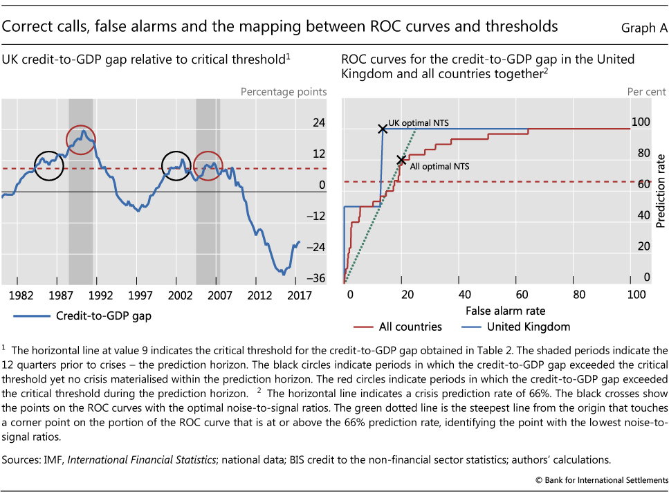
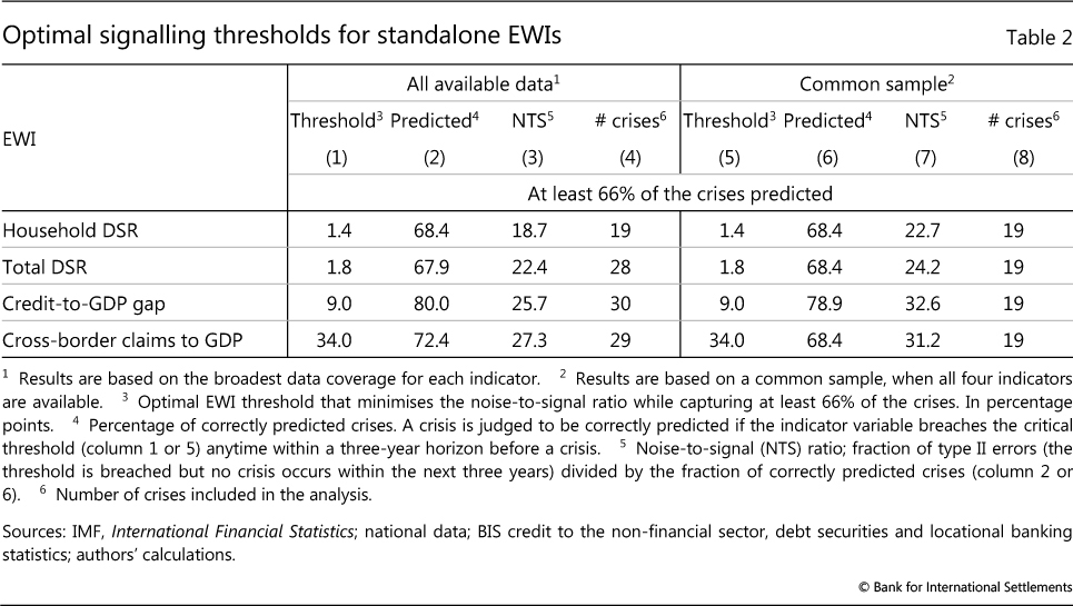
It is possible to illustrate the trade-off between correct event predictions (as a share of all events) and false alarms (as a share of all normal periods) when choosing a threshold in the case of the credit-to-GDP gap for the United Kingdom. The left-hand panel of Graph A shows the evolution of the gap since 1980. The shaded areas highlight the three years before the crises in 1991 and 2007, the period when we would like to see a signal based on the assumed three-year prediction horizon. The dashed red horizontal line indicates a credit-to-GDP gap of 9 - the optimal threshold given our analysis (Table 2). In both pre-crisis periods, the gap exceeded 9, so the prediction rate is 100% (red circles). Yet there are also false alarms (black circles). Increasing the threshold above 9 reduces the number of false calls. But once the threshold exceeds 11.5, the crisis in 2007 is no longer predicted, so that the prediction rate falls to 50%. Conversely, lowering the threshold from 9 does not increase the prediction rate and leads only to more false alarms.
The receiver operating characteristic (ROC) curve captures this trade-off between correct predictions and false alarms for all thresholds. For the United Kingdom, the prediction rate can only be 100%, 50% and 0% (Graph A, right-hand panel, blue line), with false alarm rates decreasing as the threshold increases. The solid red line depicts the ROC curve for the credit-to-GDP gap based on all the available data in our sample. We can see that the credit-to-GDP gap is an informative indicator but is not perfect. For a perfect indicator we would find at least one threshold with a prediction rate of 100% and a false alarm rate of 0%. At the other end of the spectrum, a completely uninformative indicator would have an ROC curve that equalled the 45° line for every threshold, ie the same rate of correct and false calls.
The area under the ROC curve (AUC) provides a summary measure of the signalling quality of an indicator. Intuitively, it captures the average gain over the uninformed case (the 45° line) across all possible threshold combinations. The uninformative indicator has an AUC equal to 0.5 (ie the area under the 45° line equals 0.5), while that for the fully informative indicator is equal to 1. The intermediate cases have values in between.
While the ROC maps the full set of trade-offs, the policymaker may weigh missed crisis calls and false alarms differently. Unfortunately, these preferences are not known. As discussed in the main text, we therefore assume that policymakers choose a threshold that minimises the noise-to-signal ratio (the ratio of false alarms to correctly predicted events), while capturing at least two thirds of the crises.
It is possible to find the points on the ROC curve that correspond to the optimal thresholds for the United Kingdom and the more general case (black crosses). The UK case is especially intuitive. One picks the part of the ROC curve that identifies a prediction rate of at least 66% of crises - here the only possible one is 100%. Next one moves on that line as far as left as possible, thereby minimising false alarms, ie one chooses the leftmost corner. The more general case is slightly more complicated, although the procedure is the same. One picks the steepest line from the origin (dotted green line) that touches a corner point on the portion of the ROC curve that is at or above the 66% prediction rate (red dashed line). This works because the slope of such a line equals the signal-to-noise ratio of the threshold associated with the corner point on the ROC curve. And as the signal-to-noise ratio is the inverse of the noise-to-signal ratio, the steepest line finds the point on the ROC curve with the lowest noise-to-signal ratio.